When 3000 lines of code becomes an experience
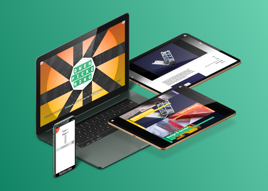
I designed and developed my personal e-portfolio over the course of 4 months using HTML, CSS, JS, PHP and MySQL. It is an experiment in immersive web design, and is fully compatible with all devices and browsers.
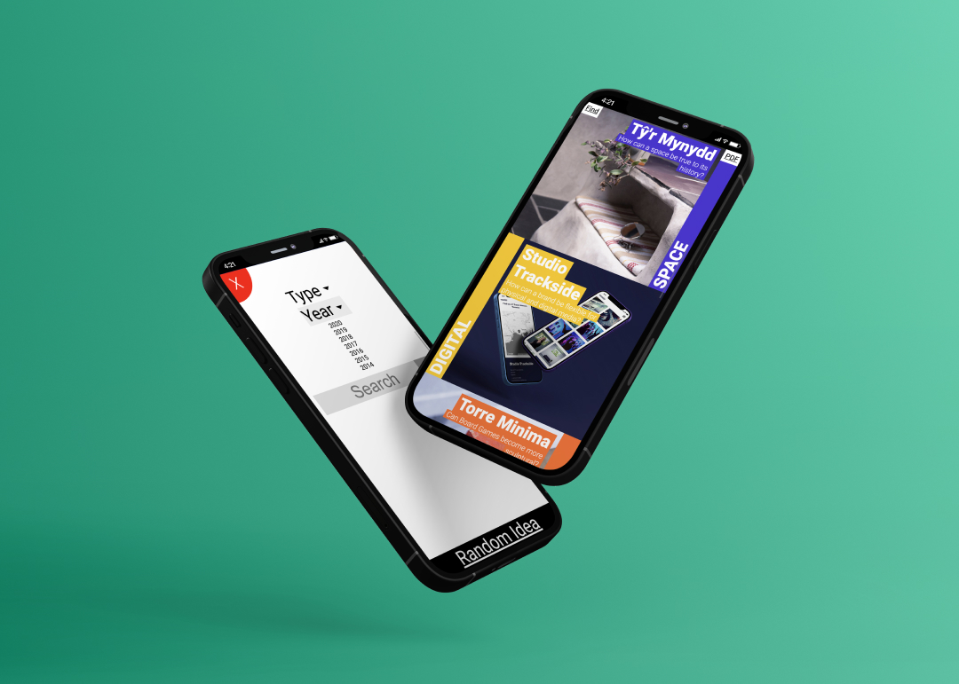
The main page is automatically generated from scratch using PHP and SQL, allowing content to be added modularly and searched easily. It showcases my more creative ideas, and is designed to feel like an open space through its fixed, sunset background, whereas the project pages feel like more enclosed and cosy side rooms.
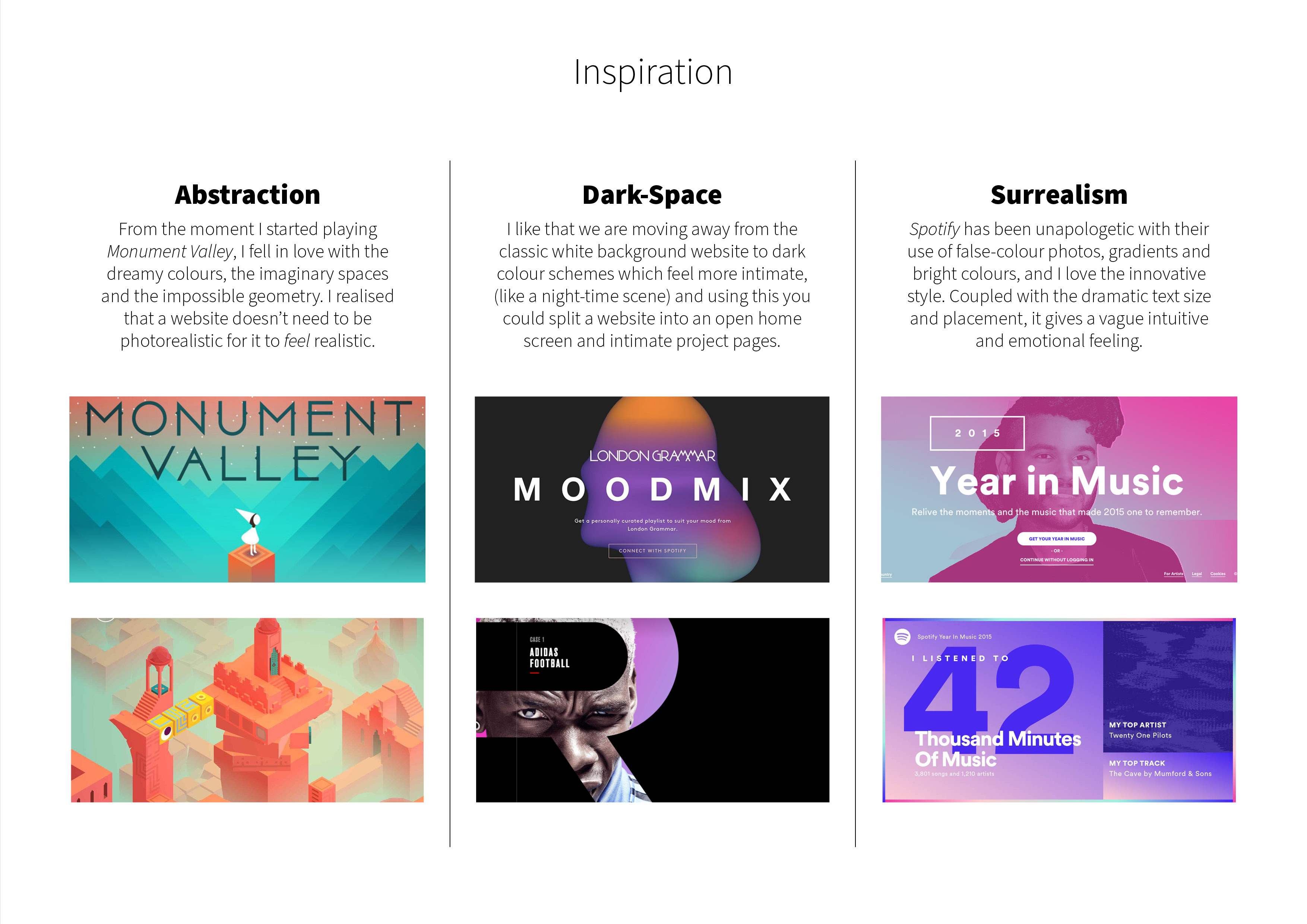
Inspiration
Abstraction
From the moment I started playing Monument Valley, I fell in love with the dreamy colours, the imaginary spaces and the impossible geometry. I realised that a website doesn’t need to be photorealistic for it to feel realistic.
Dark-Space
I like that we are moving away from the classic white background website to dark colour schemes which feel more intimate, (like a night-time scene) and using this you could split a website into an open home screen and intimate project pages.
Surrealism
Spotify has been unapologetic with their use of false-colour photos, gradients and bright colours, and I love the innovative style. Coupled with the dramatic text size and placement, it gives a vague intuitive and emotional feeling.
Visual Design
Form
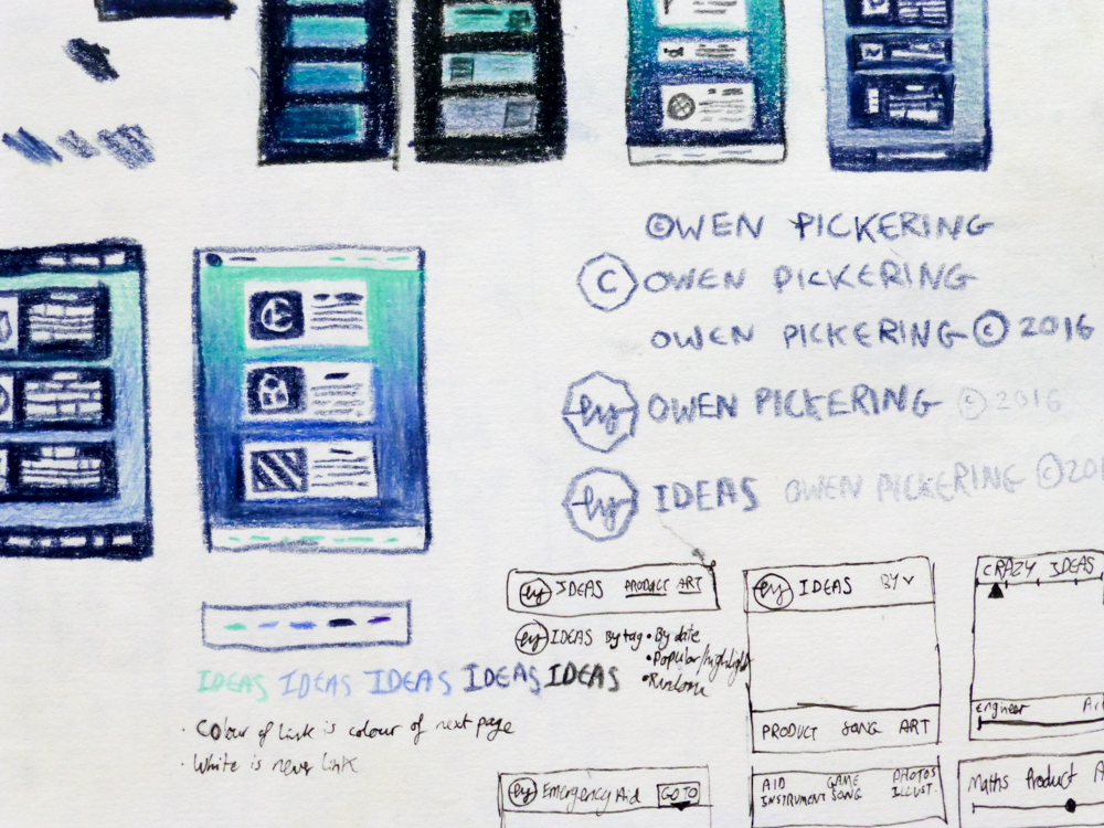
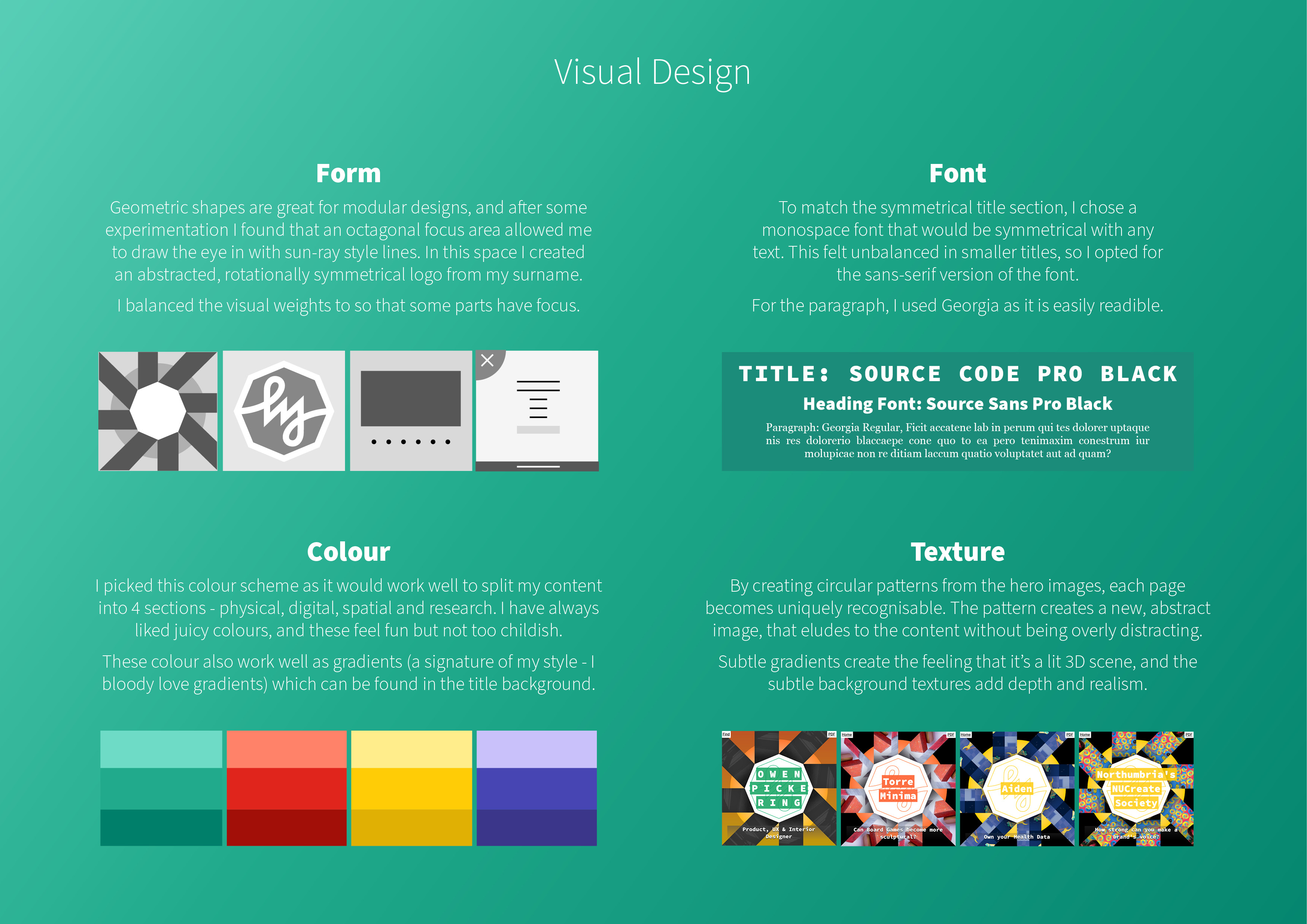
Geometric shapes are great for modular designs, and after some experimentation I found that an octagonal focus area allowed me to draw the eye in with sun-ray style lines. In this space I created an abstracted, rotationally symmetrical logo from my surname. I balanced the visual weights to so that some parts have focus.
Font
To match the symmetrical title section, I chose a monospace font that would be symmetrical with any text. This felt unbalanced in smaller titles, so I opted for the sans-serif version of the font. For the paragraph, I used Georgia as it is easily readable.
Colour
I picked this colour scheme as it would work well to split my content into 4 sections - physical, digital, spatial and research. I have always liked juicy colours, and these feel fun but not too childish. These colour also work well as gradients (a signature of my style - I bloody love gradients) which can be found in the title background.
Texture
By creating circular patterns from the hero images, each page becomes uniquely recognisable. The pattern creates a new, abstract image, that eludes to the content without being overly distracting. Subtle gradients create the feeling that it’s a lit 3D scene, and the subtle background textures add depth and realism.
Programming
PHP, HTML & SQL
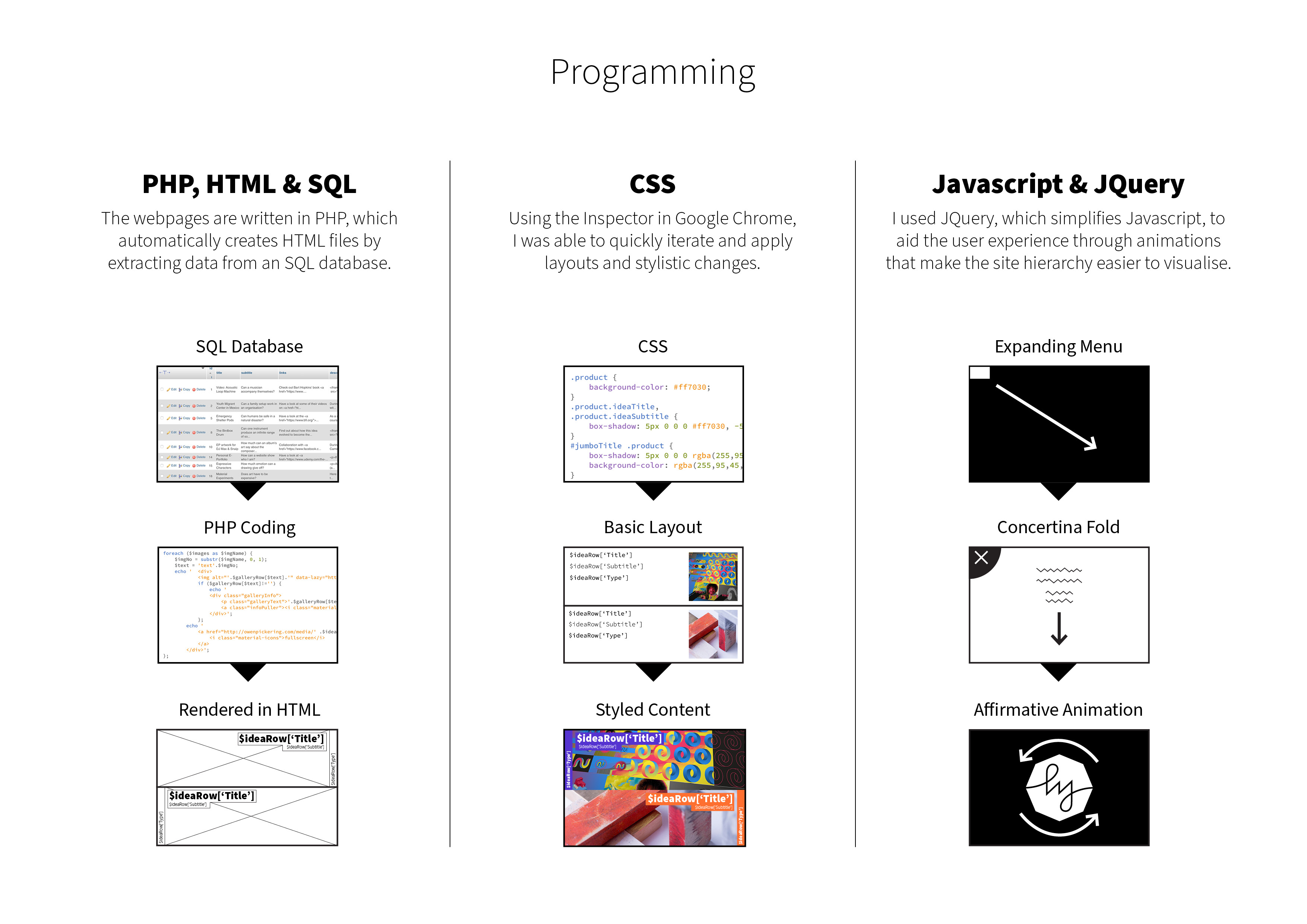
The webpages are written in PHP, which automatically creates HTML files by extracting data from an SQL database.
CSS
Using the Inspector in Google Chrome, I was able to quickly iterate and apply layouts and stylistic changes.
Javascript & JQuery
I used JQuery, which simplifies Javascript, to aid the user experience through animations that make the site hierarchy easier to visualise.

A New Material Design
The visual design is a twist on Google’s Material Design Guidelines, which can leave some websites looking generic.
Clear Hierarchy
To allow for quicker decision making, the filter view completely hides the home page results until a filter is chosen. Filter content is initially collapsed, and titles are short and clear, to speed up understanding of the page.
Minimal Navbar
To allow the content to take up as much space as possible, I created two navbar elements with a minimal footprint.
Year
2016Type
large, design, brand, digital,Further Reading
Have a look at Udemy's "Complete Web Developer" Course.Feeling lucky? Click me for a random idea!
© Owen Pickering 2022