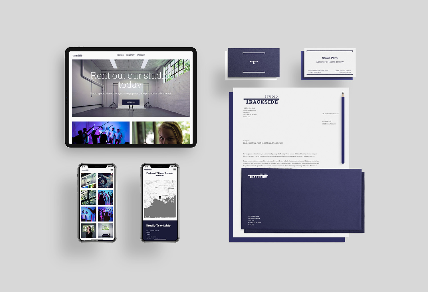


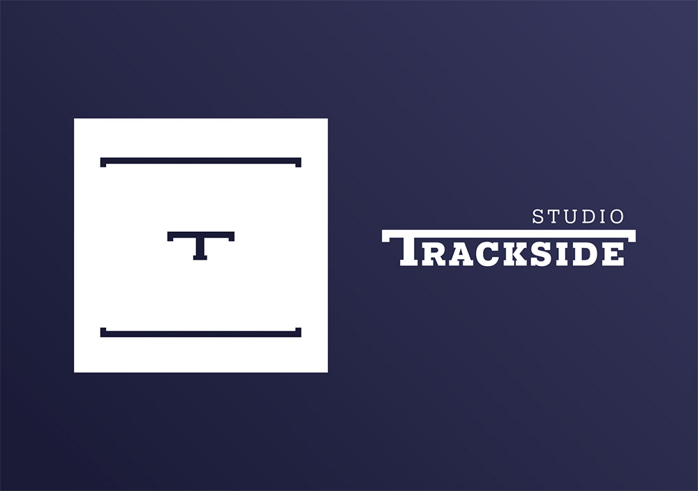

During my time as Video Editor & Digital Marketing Manager at Studio Trackside, Toronto, I was tasked with branding the up-and-coming videography studio. I chose the name Trackside to refer to the disused railway track that runs outside the studio, which had been used to cart ammunition from the building a century before. The name also conjures up images of video tracks; the studio's main tool.
To build the brand, I designed a logo that could be expanded to become a motif for all Trackside products. The brackets are used to emphasize text, whilst mimicking camera guides. The font, Pragmatica Slab, is reminiscent of old Western fonts and feels industrial yet contemporary.
The style of photography was very important for expressing the studio's focus on emotional storytelling. I took a series of photos that concentrate on the visual details that are usually ignored, to show how the studio's work celebrates these rare moments.
Feeling lucky? Click me for a random idea!
© Owen Pickering 2022